Project Type
Solo Project
Role
UI/UX Designer
Tools/Engine
Figma
Timeline
~20 weeks
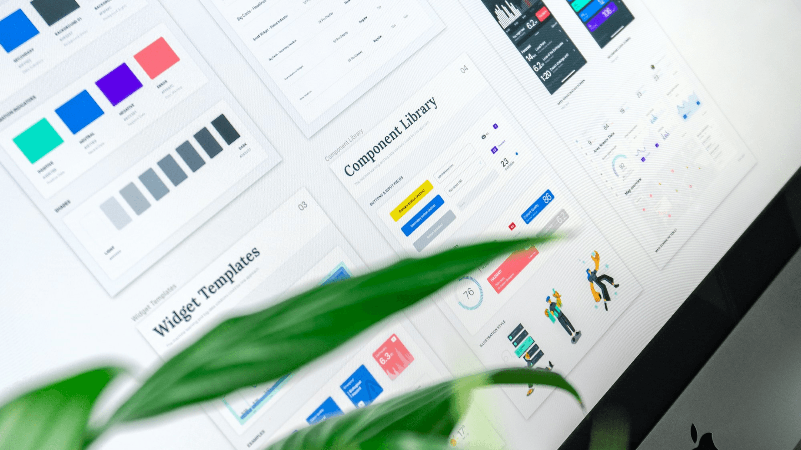
This project involved updating and standardizing several important pages on Naukri's platform that had become outdated and inconsistent in design. My primary goal was to apply the new design system, ensuring uniformity in design and interactions across the platform. This update included not only transferring existing information into the refreshed design language but also making thoughtful UX enhancements. These improvements focused on increasing usability, implementing requested features, and removing deprecated elements to deliver a streamlined and user-friendly experience.
Conducted thorough user research to identify areas for improvement and implemented changes to enhance usability.
Incorporated new features based on user feedback to enhance product functionality and enhancing the workflow of the recruiters.
Rigorously followed the design system guidelines to maintain a cohesive and professional look and feel.
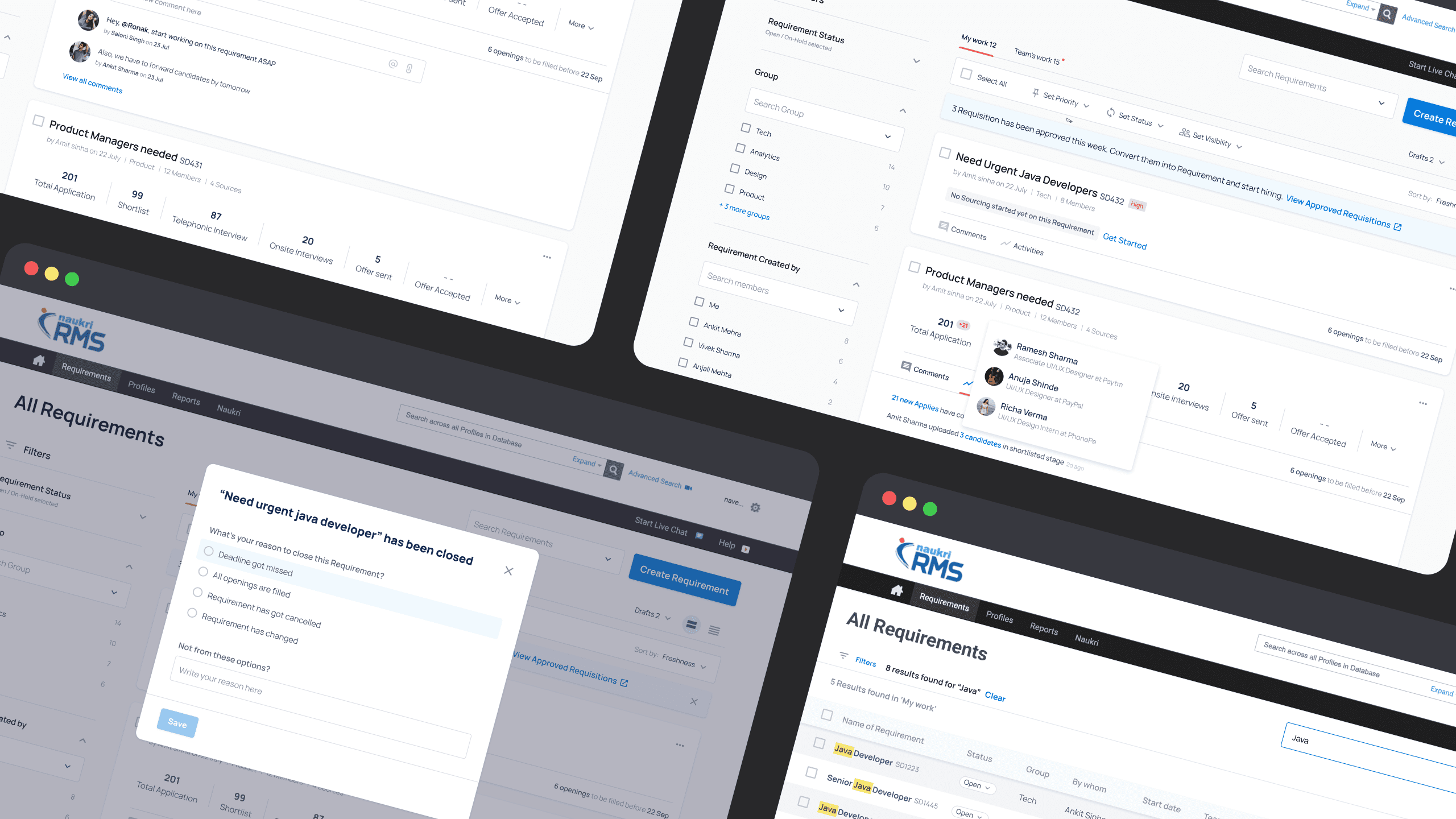
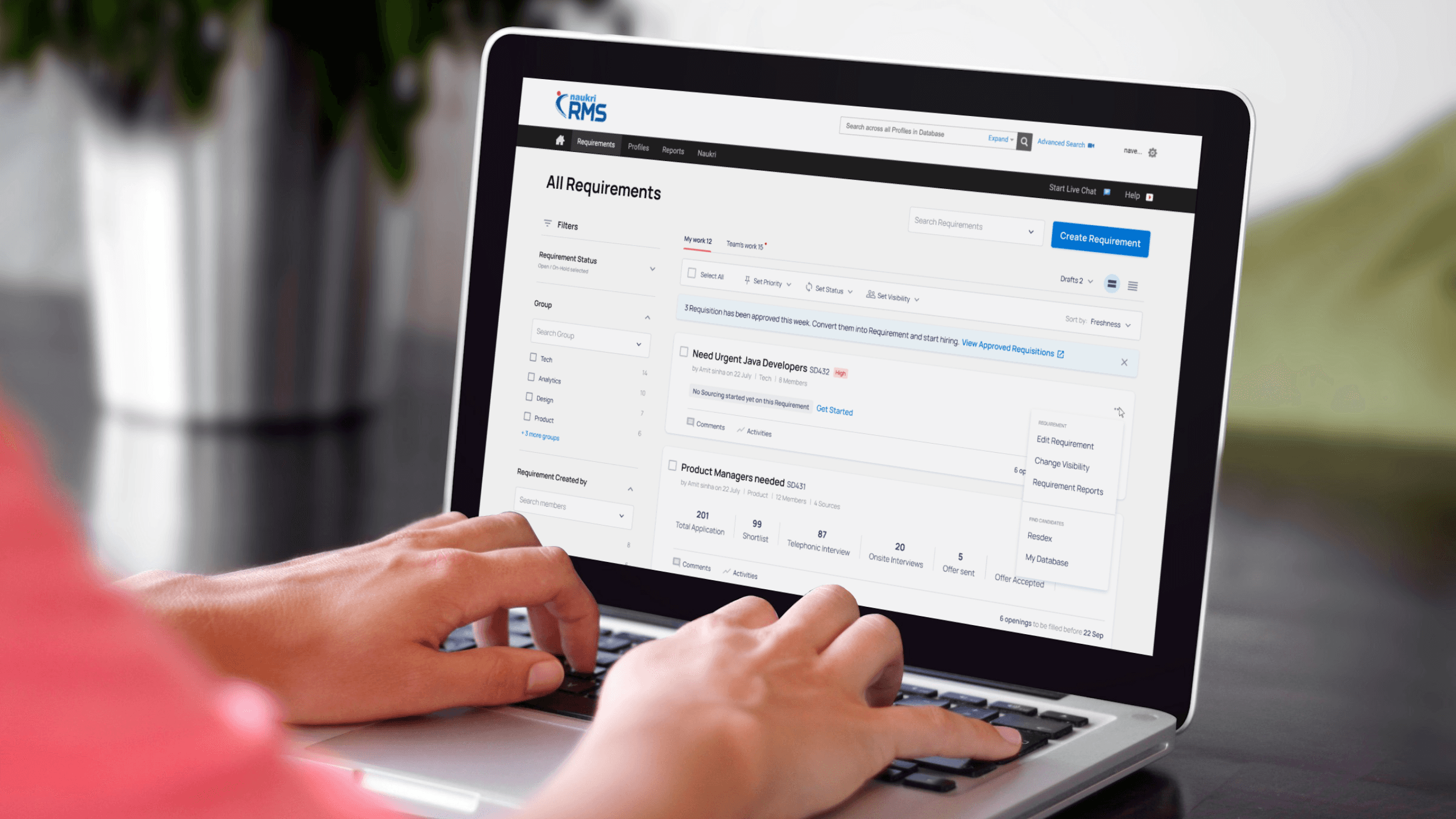
Naukri RMS offered recruiters the ability to create customized hiring workflows tailored to each client’s requirements. Recruiters could source candidates from Resdex, job postings, or other sources, while the platform allowed for custom workflows with adjustable stages and automation. For instance, transitioning a candidate from the “shortlisted” stage to the “offered” stage could automatically trigger the generation and email delivery of an offer letter.
Objective: Enhance the user experience and integrate the evolving design system.
Problems: Address the complexity and granularity of flows while maintaining clarity and usability.
Solution:
• Introduced tuple view and excel view for flexible data display.
• Provided recruiters with customizable options to suit diverse workflows and preferences.
Impact: Improved functionality and adaptability, ensuring the platform catered to varying user needs.
This version of the page was created during the early stages of developing Naukri’s design system, which led to some inconsistencies between this design and other revamped projects. Over time, the Naukri RMS (Recruitment Management System) product was deprecated following Info Edge’s acquisition of Zwayam, which subsequently replaced the existing RMS flow within the platform.
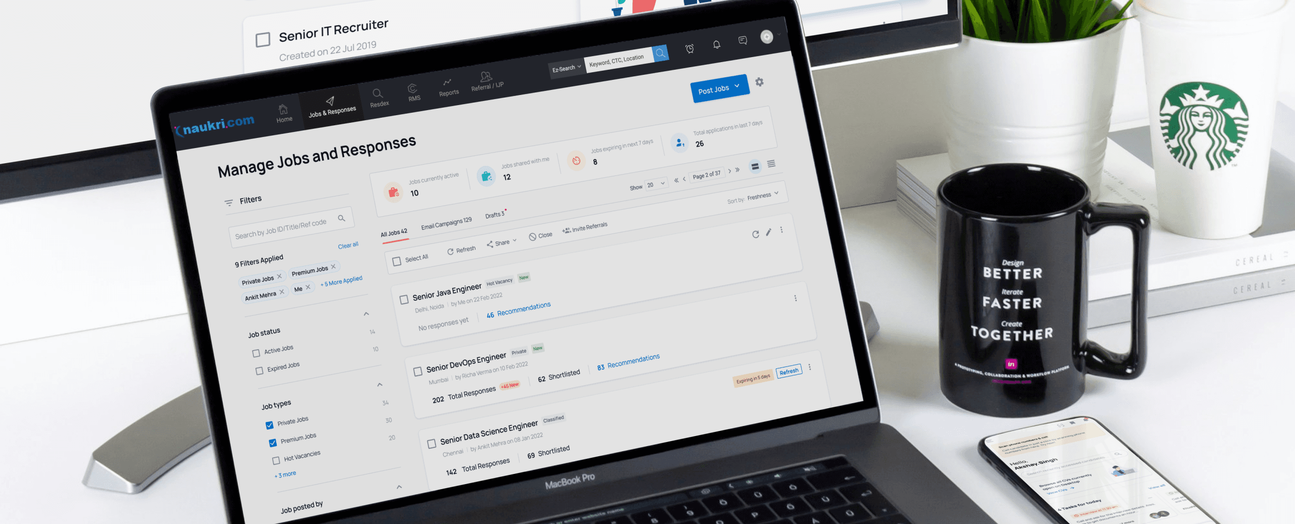
The Manage Jobs and Responses page is one of the key pages in the Naukri Recruiter site. The recruiters can see a list of all the jobs they’ve posted and check how many responses they have got for each job. This page was outdated and lacked visual clarity. The poorly structured information hierarchy made it difficult for recruiters to quickly locate crucial details like the confusing icons and a red inactive tag.
Problems:
• Outdated design with poor visual clarity and inconsistent structure.
• Confusing icons and a red inactive tag made it hard to interpret statuses.
• Lack of visual cues for updates like expiring jobs or new responses created an unintuitive experience.
Solution:
• Modernized the page using the new design system, ensuring consistency across the platform.
• Added an overview widget at the top for quick access to key insights and actions.
• Made filters more versatile and prominently positioned for easier access.
• Restructured the information hierarchy, prioritizing critical details like response counts.
• Introduced tags to highlight statuses such as new postings, expiring jobs, and new responses.
Impact:
• Excel view received overwhelmingly positive feedback for its flexibility and efficiency.
• Design updates catered to diverse user preferences while maintaining consistency with the platform's design standards.
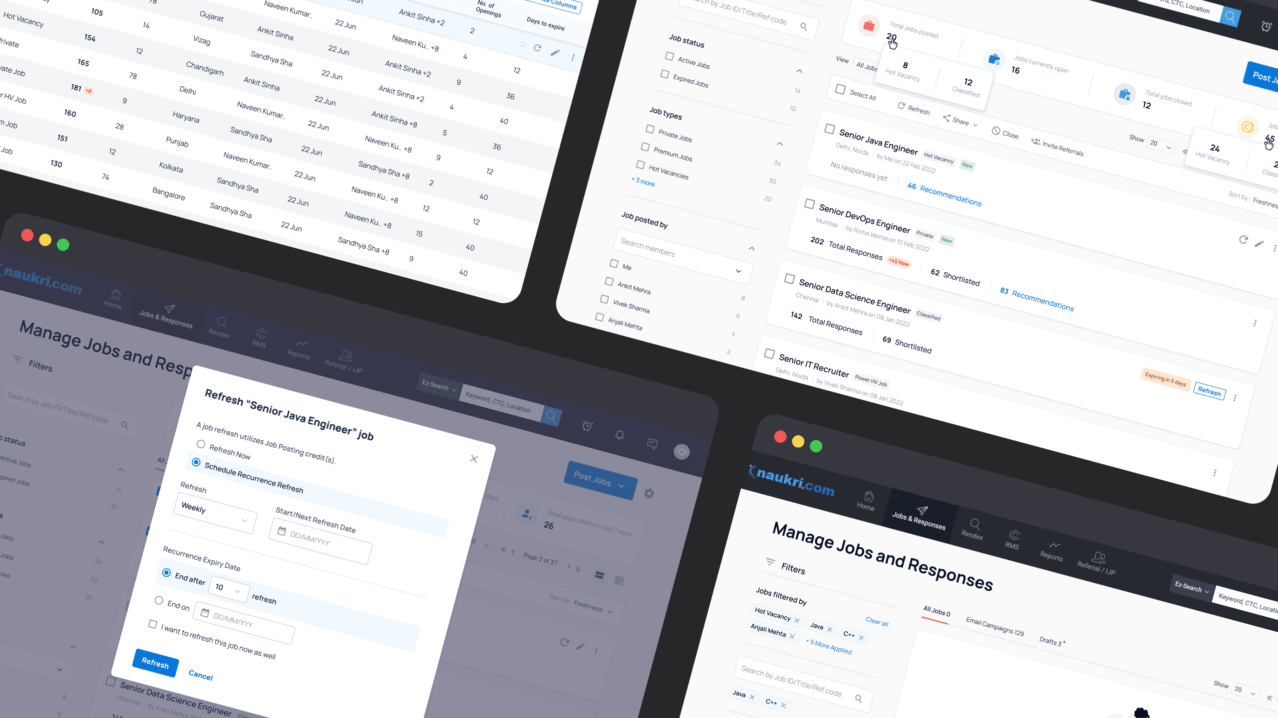
During usability testing of the redesigned Manage Jobs and Responses page, the new card-based design received mixed feedback. While some users appreciated the modern look and improved focus on each tuple, others expressed concerns about the increased space taken by each card, which limited the number of visible jobs per view.
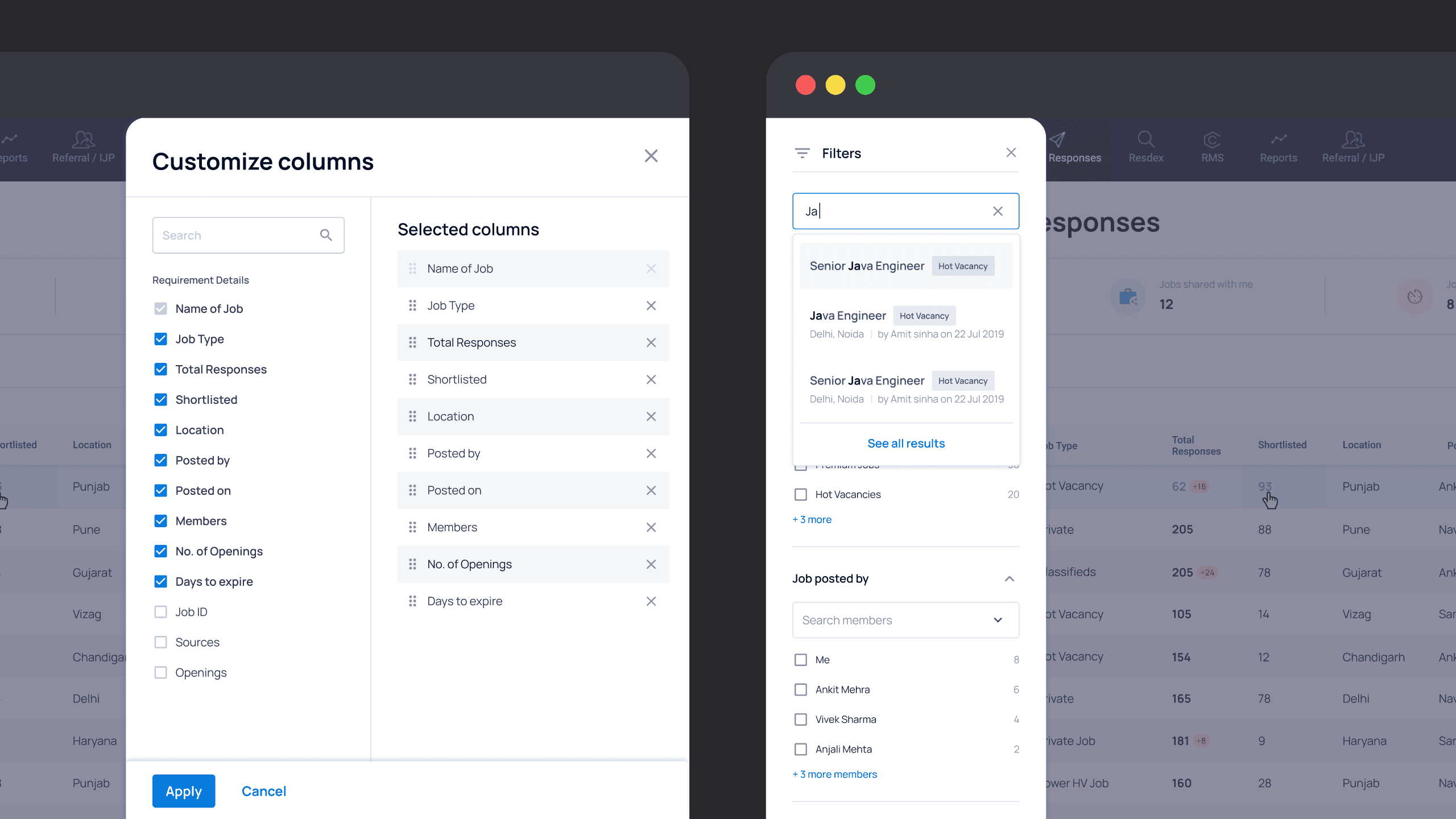
To address this, we introduced an Excel view as an alternative. This layout provided a compact, tabular format, enabling users to see more jobs at once. Additionally, we added customization options that allowed users to choose the information displayed and rearrange columns to suit their workflow. Filters were moved to an overlay on the side for easier access and a cleaner interface.
The Excel view received overwhelmingly positive feedback, with users praising its flexibility and efficiency, particularly for managing large volumes of job postings. This iteration ensured the design catered to diverse user preferences while maintaining consistency with the overall system.
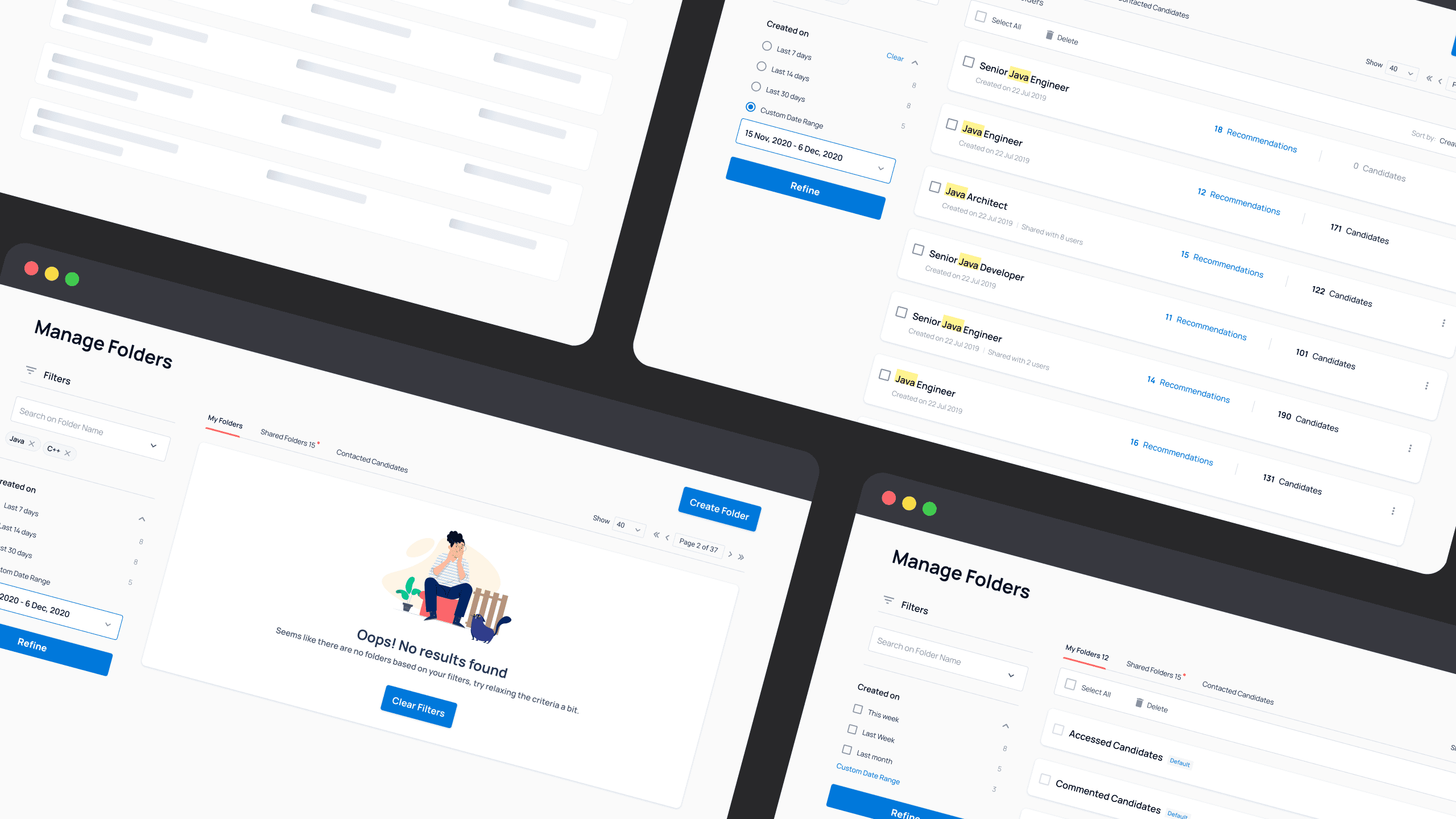
The Folder Listing page in Resdex, where recruiters organize candidates sourced from the Naukri database into folders, was outdated and lacked essential features to enhance usability.
Problems:
• The page was visually outdated and lacked alignment with the updated design system.
• Recruiters had to open folders to view candidate counts, increasing effort and time.
• The absence of candidate recommendations limited the recruiter’s ability to discover potential candidates efficiently.
Solution:
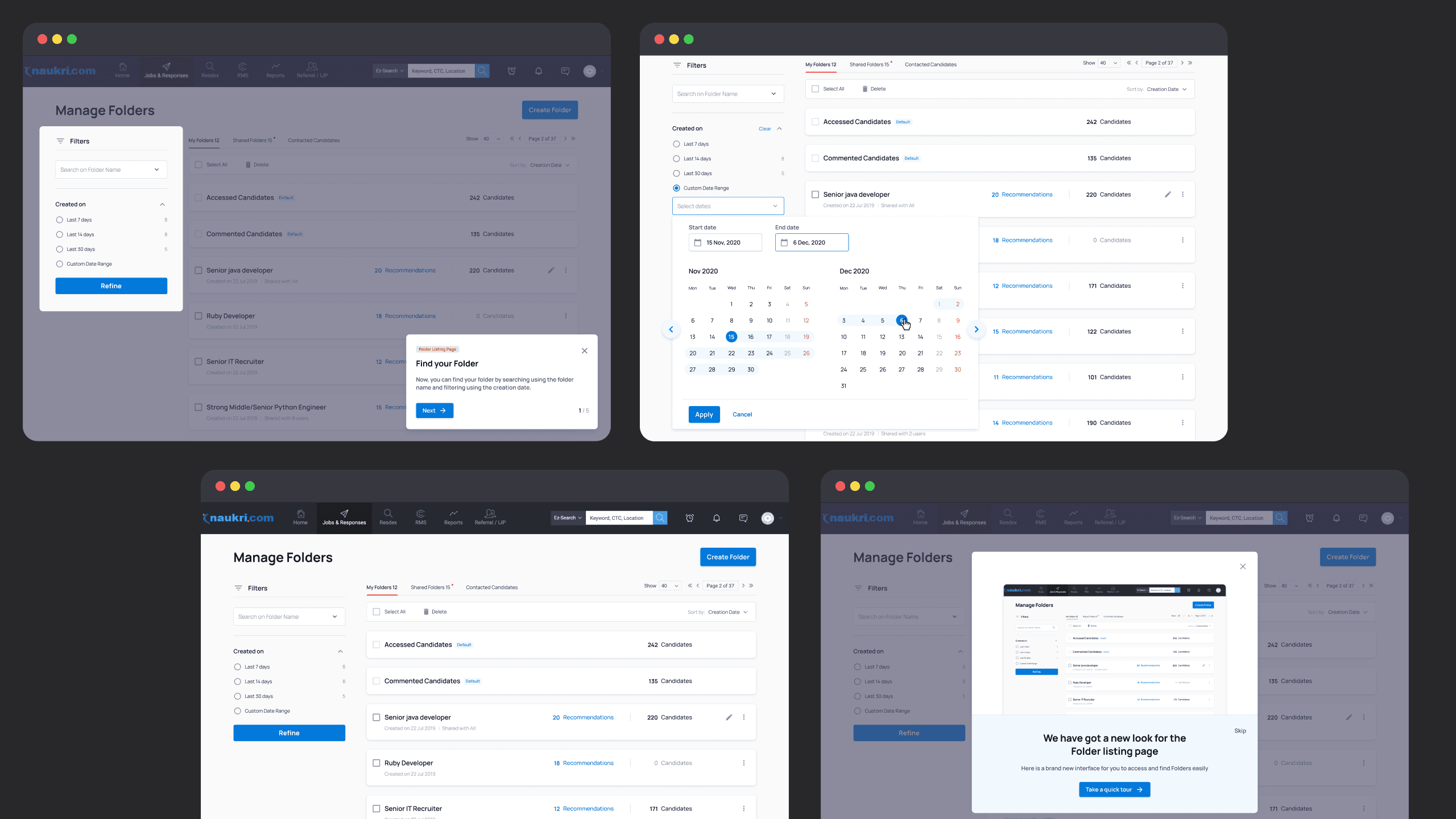
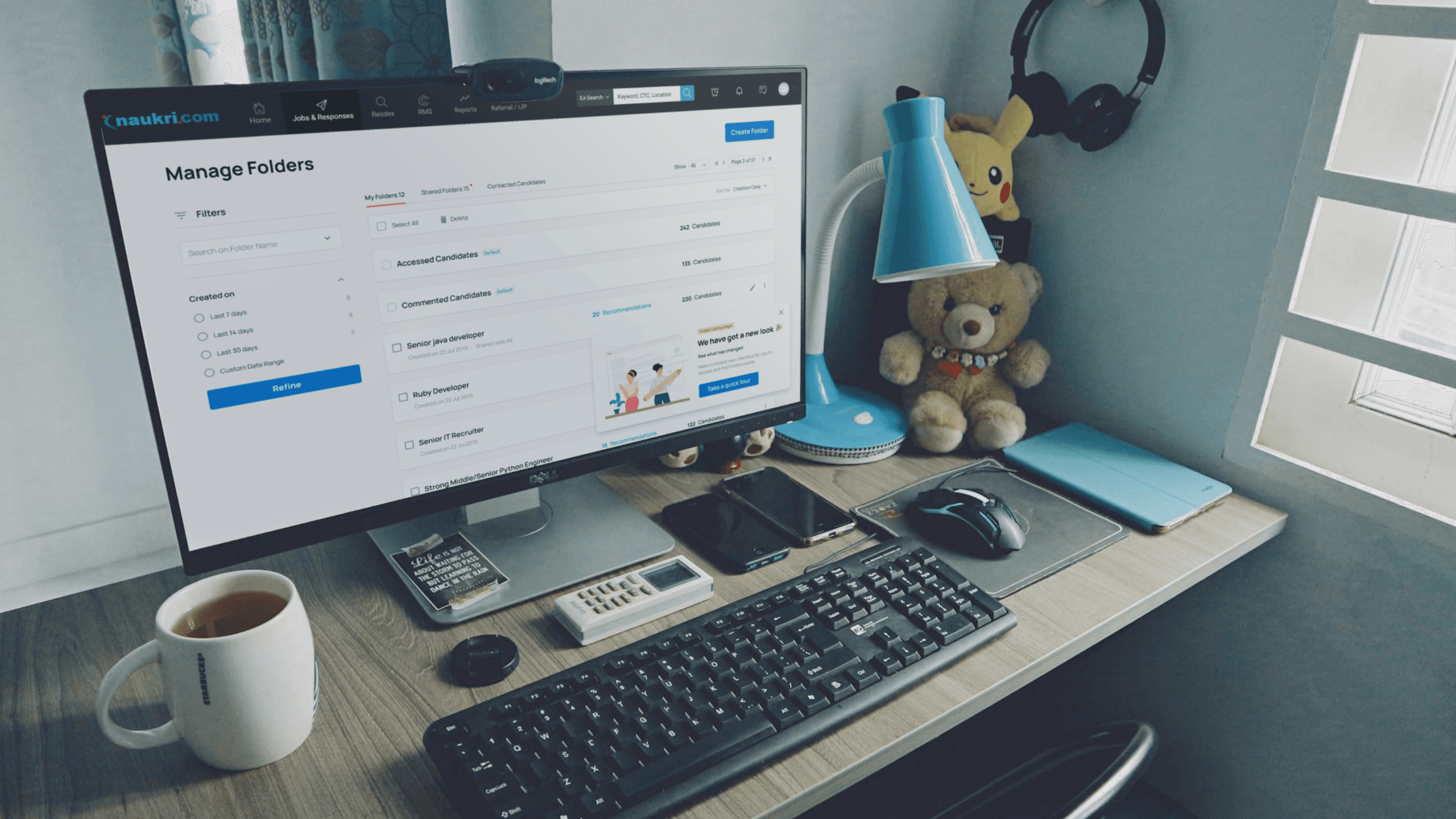
• Revamped the page to align with the updated design system for consistency across the platform.
• Displayed candidate numbers upfront for each folder, enabling quick assessments and actions.
• Integrated advanced algorithms to show relevant candidate suggestions within folders.
Impact:
• Recruiters could manage folders and discover candidates more quickly.
• The intuitive layout reduced time spent navigating and improved decision-making.
• Created a cohesive and modern interface that aligned with the overall platform design.
Additionally, I incorporated a feature to show AI-powered candidate recommendations within the folders. This leveraged advanced algorithms to surface relevant profiles, helping recruiters discover potential candidates more efficiently. These enhancements streamlined the folder management process and made the page more intuitive and actionable for recruiters.
These were some of the key pages in the Naukri Recruiter site that I had the privilege to revamp from the ground up. Each project contributed not only to enhancing user experience but also to shaping and evolving the design system along the way. The design system grew to address the unique needs of these projects, providing designers with versatile components that could adapt to a wide range of requirements.
These updated designs aligned the product with a unified design language with enhanced usability and aesthetic appeal.


